Joyner is a mobile app that helps people discover local events — from underground art markets to spontaneous meetups — in one place, with zero noise.
Joyner became my AI Product Design experiment: I used Claude Code and Figma MCP to move from a product concept into a structured, developer-ready and partially coded mobile prototype. I directed the product logic, UX decisions, visual system and validation, while AI helped accelerate research synthesis, design audit, handoff documentation, token extraction and React Native prototyping.
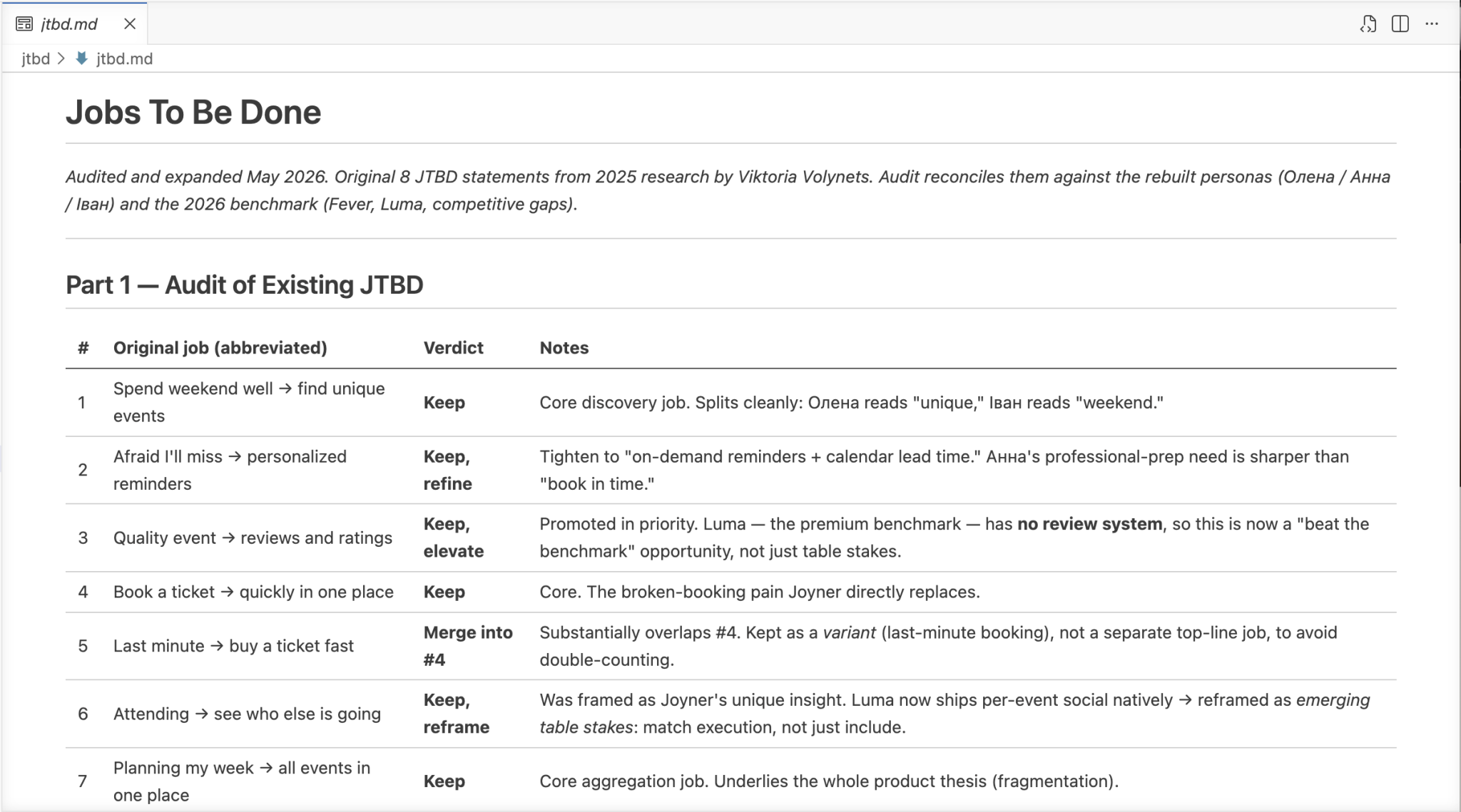
Research, Personas, JTBD, Sitemap, UI Design, Design System
Year
2025
The Problem
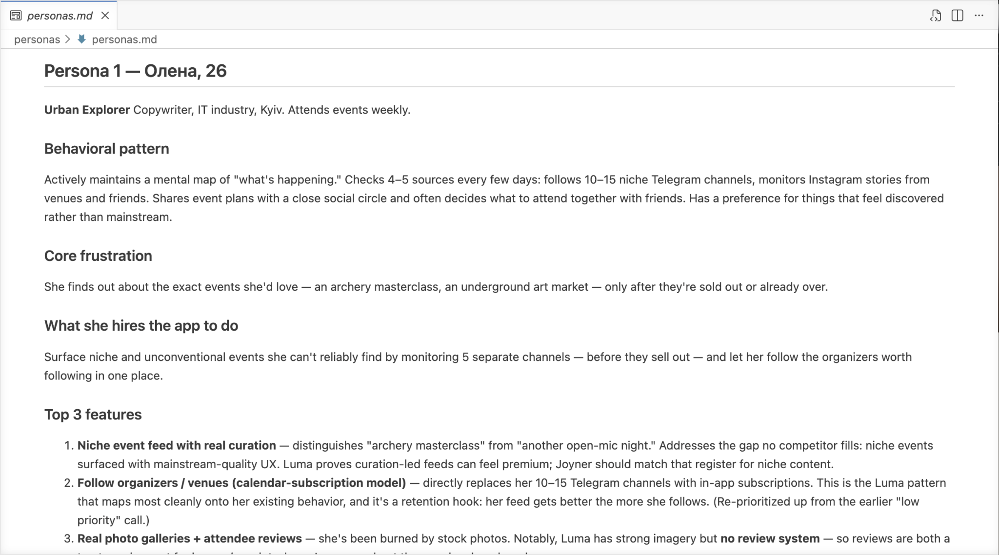
People miss events in their own city. Not because nothing's happening — but because information is scattered across Telegram channels, Instagram stories, Bodo, and word of mouth. By the time someone finds out about something, it's either sold out or already over.
There’s no single, reliable source. No personalization. No way to know who else is going.
Core problems identified through research:
No centralized platform — users juggle 5+ sources just to find weekend plans
Events discovered too late to act on
Hard to find events that match specific interests (not just mass concerts)
Difficult to navigate large events once there
Booking flows on existing platforms are unreliable — reservations disappear, need manual reconfirmation
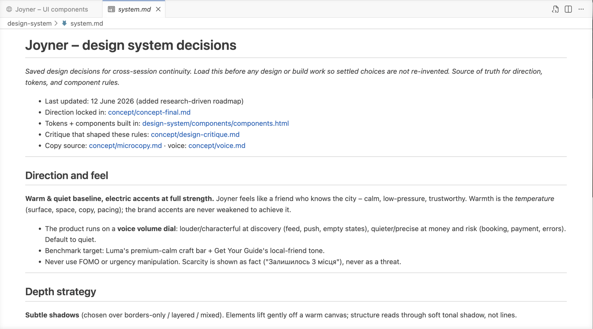
AI as a production workflow, not a shortcut.
AI Workflow
I directed the product decisions and used AI tools to accelerate the loop: critique, structure, document, prototype and iterate
1
Frame
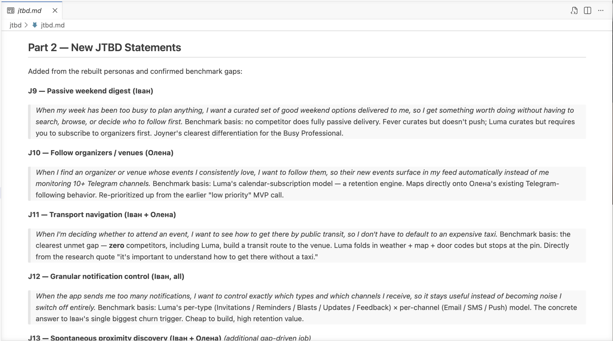
Problem, users, JTBD, MVP scope
2
Audit
Figma MCP review of structure and craft
3
Systemize
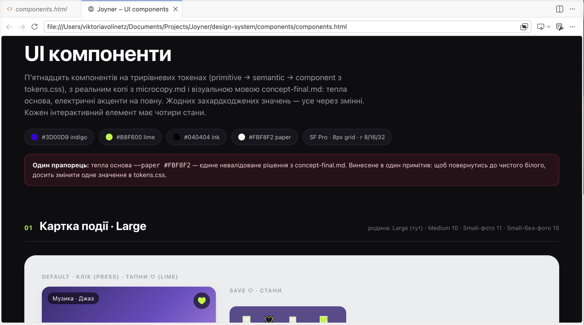
Tokens, components, states, rules
4
Prototype
Expo / React Native screens
5
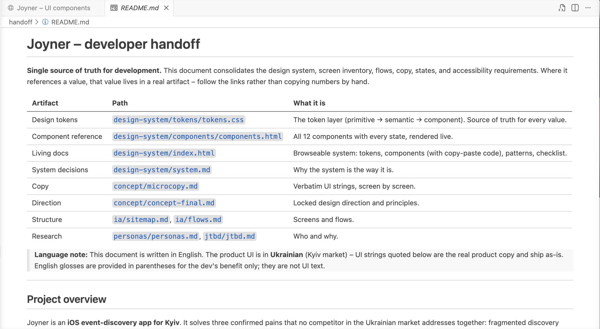
Handoff
Single source of truth + playbook
Swipe to explore
HUMAN-LED
Product framing, UX priorities, visual judgment, final decisions, quality control.
AI-ASSISTED
Research synthesis, critique pass, token extraction, documentation, prototype
scaffolding.
Immerse people in the life of their city through events. Make city life more interesting, lighter, and more spontaneous. Show that there’s always something happening nearby — you just need to look.
Tone of Voice
Light, friendly, modern. Inspires without pressure. No corporate tone. Has personality, respects the user.
Visual language
A focused color palette built on contrast — Lemon as the energetic accent, Blue as the brand anchor, and near-black as the base.
Color palette
Friendly, light, emotional
Information Architecture
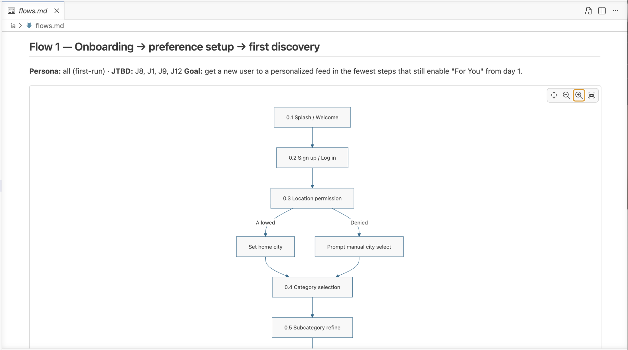
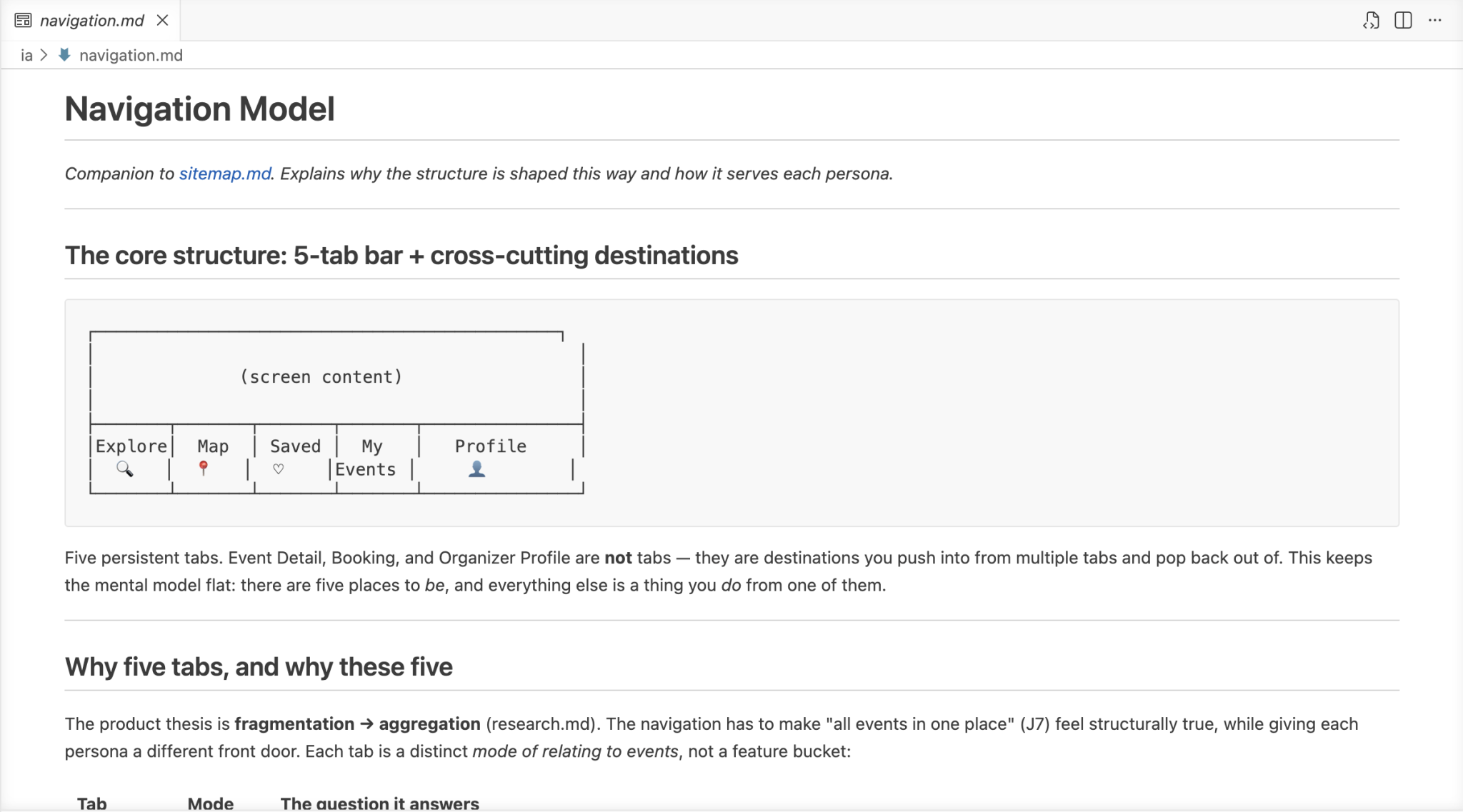
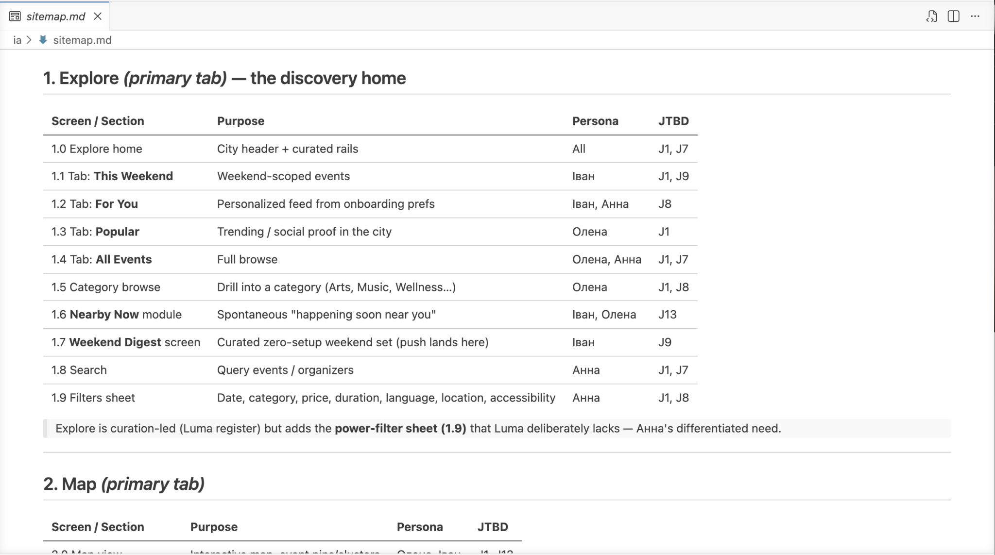
Mapped 15+ screens across 5 navigation sections and 4 key user flows, establishing clear hierarchy before moving to UI.
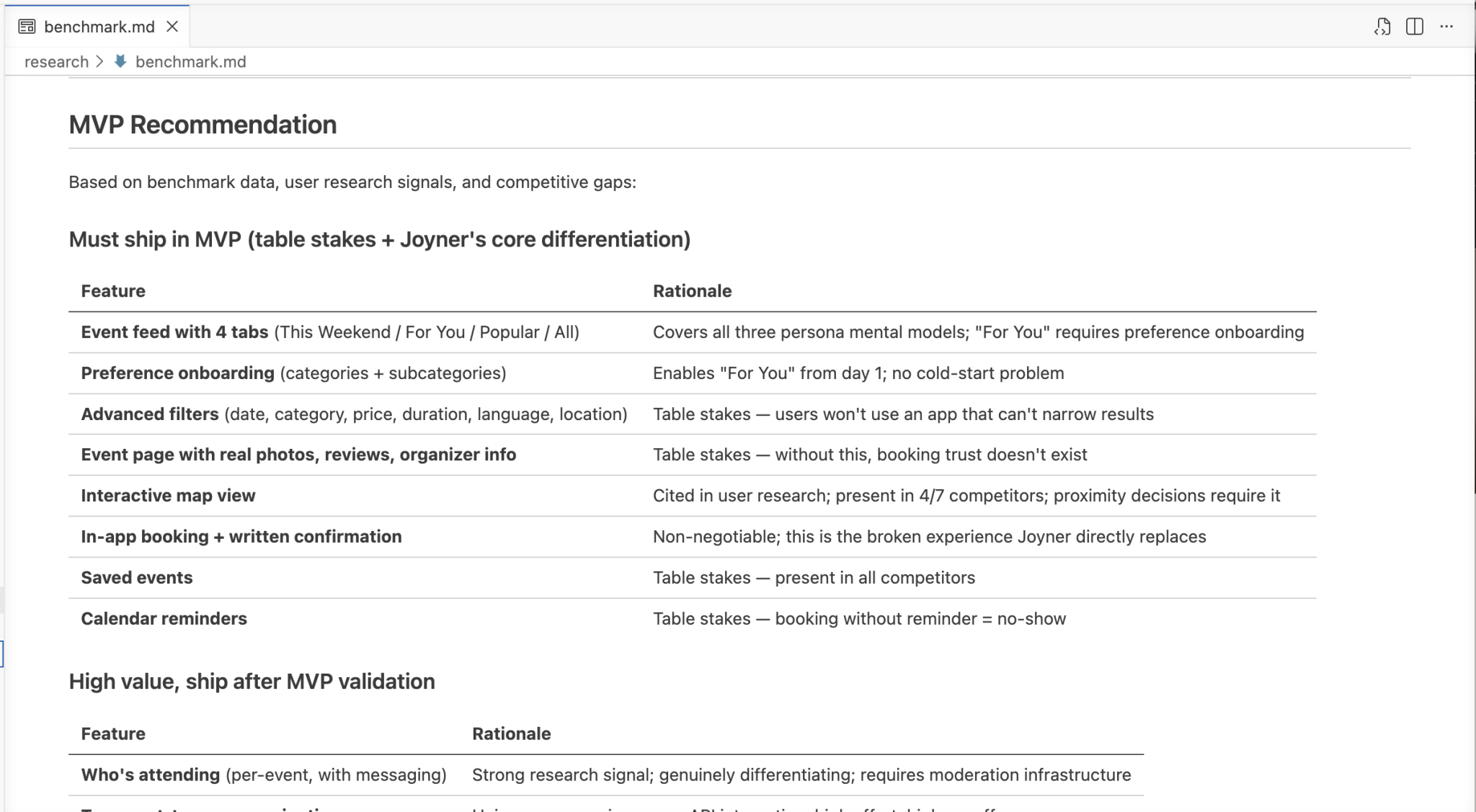
Designed around real user needs — each screen answers a specific question before the user has to ask. Four discovery tabs match different mindsets. The event page surfaces who's attending, real photos, and transport info. Booking completes in 3 steps. Users and organizers alike can add events, keeping the content alive and local.
Reflection
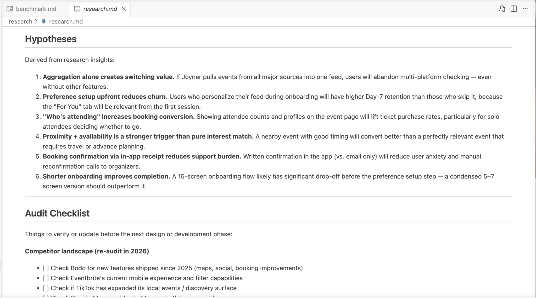
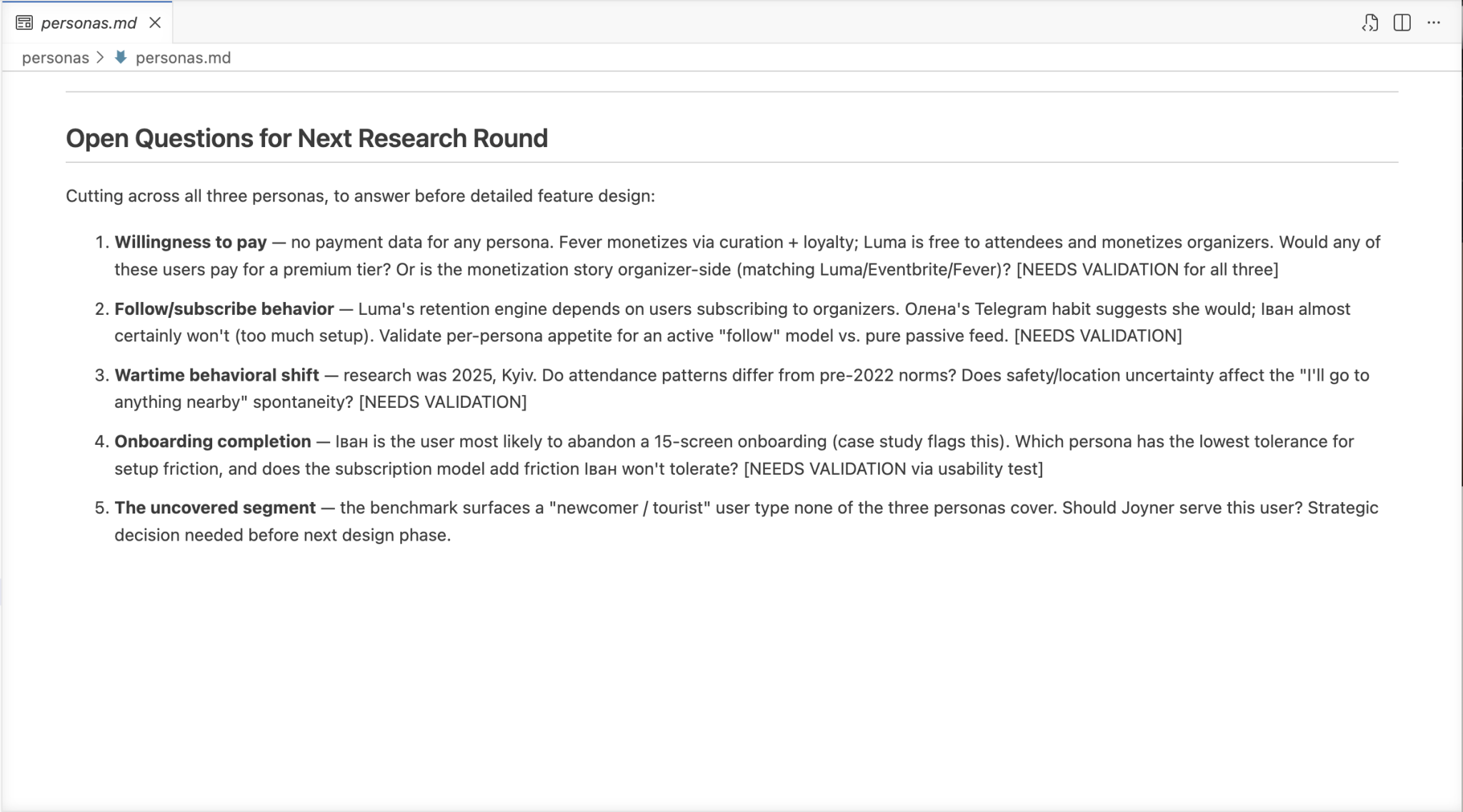
The design process moved from research → JTBD → sitemap → UI, with each step building directly on the last. The personas weren't decorative — they drove specific decisions: the "For You" tab exists because of Ivan, the "Who's Attending" screen exists because of a single quote from a real user interview.
What I’d do next: Usability testing on the onboarding flow and booking funnel. The 15-screen onboarding might be too long — I’d test a shorter version and measure completion rates.